Unraveling the mysteries of data visualization tools such as pyramid charts can be challenging, especially for beginners. But, mastering how to read a pyramid chart is a skill that can pay dividends in a variety of industries. In this article, we will demystify this popular data representation tool. Keep reading to learn more.
Understanding the Fundamentals of a Pyramid Chart
Alt text: A 3D example of a pyramid chart with rainbow colors and a black background.
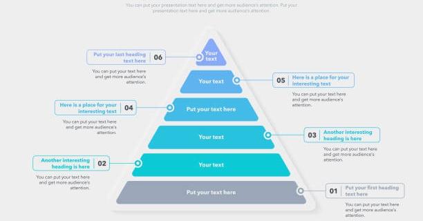
A pyramid chart is a type of diagram that showcases statistical data in the form of a pyramid. This visual representation is ideal for highlighting proportional or hierarchical relationships among different data sets.
The chart is divided into horizontal sections, with each denoting a different category. The width of each section represents the quantity of the respective category.
The categories or sections are arranged vertically, with the largest at the bottom and the smallest at the top, giving it a pyramid-like shape, and this is where it derives its name from.
Different pyramid charts may employ varying color schemes, gradients, or labeling, adding an extra layer of customization to represent data more mannered and effectively.
The Key Features of a Pyramid Chart
A pyramid chart is characterized by several key features, making it a useful tool in data representation. They include clarity of information, versatility, and ease of understanding.
A pyramid chart offers a clear hierarchical structure, which makes complex data easier to comprehend at a glance. Their visual appeal elongates the data interpretation process and enables rapid understanding.
Another distinguishing feature of pyramid charts is their versatility. They can represent diverse data types, including demographics, sales figures, and other business metrics.
The Process of Analyzing a Pyramid Chart
The process of analyzing a pyramid chart begins with the identification of the categories represented in the chart. These categories typically serve as the x-axis labels.
Next, observe each section’s width to identify each category’s values or quantities. This step can lead to immediate insights regarding trends or major differences among categories.
Pay close attention to the order of categories, which can provide valuable information about the hierarchy or order of importance among these categories.
Last, study the color coding or other demarcations used in the chart. These can often indicate additional information layers or nuances crucial to comprehensive data interpretation.
Pyramid Charts in Business: Benefits and Limitations
Alt text: A 3D pyramid chart on a desk in front of someone working on data.
Many businesses utilize pyramid charts due to their ability to showcase hierarchies and proportional relationships clearly. They’re excellent tools for displaying marketing or sales data and can drive strategic decision-making.
Moreover, they can be used by human resources (HR) departments to display company structures, by finance teams to showcase budget allocation, and by project managers to envision project timelines.
However, there are certain limitations to pyramid charts. They may not be suitable for representing detailed, specific data sets or complex relationships between different categories. Additionally, they can sometimes be misleading if the data is not appropriately scaled or if the sections are drawn disproportionately.
Despite these limitations, pyramid charts remain a robust tool for business and statistical data visualization as long as their use is fit for the purpose and the data is appropriately scaled.
Pyramid charts are versatile and effective tools for data visualization, capable of simplifying complex data sets into understandable visual representations. Once you understand the fundamentals and key features of pyramid charts and follow the practical steps to read and interpret them, you will find them an invaluable tool in your data interpretation arsenal.
